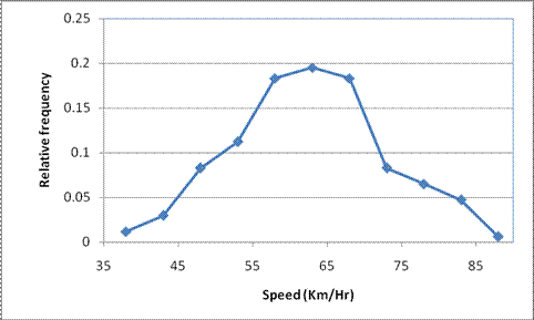
Figure 2.3: Relative frequency polygon of speed data of cars
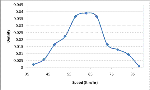
Figure 2.4: Observed densities of the speed data
Cumulative frequency diagrams
Cumulative frequency diagram is obtained by plotting the cumulative sum of the relative frequencies against the ends of the class boundaries. In the cumulative relative frequency diagrams, the ordinates represent the cumulative frequency of the occurrence of events less than or equal to the value on the abscissa. If the observed data points tend to infinity the resulting cumulative relative frequency diagram is called as cumulative distribution function. Figure 2.5 shows the cumulative relative frequency diagram of the speed data shown in Table 2.1. From the cumulative relative frequency diagrams it is easy to get the median and the other quartiles (median and the quartiles are covered in the numerical description of the data). A cumulative frequency diagram is also known as the quantile plot or the Q-plot. Quantiles are nothing but (n-1) values that divide the total frequency into n equal parts and in a quantile plot the qunatiles are shown on y-axis. Quantiles of two different data sets or the theoretical and the observed quantiles can be compared using the Q-Q plots.
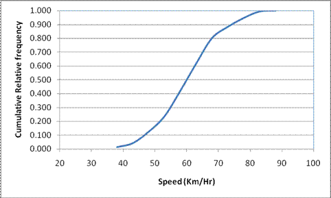
Figure 2.5: Cumulative relative frequency of the speed data shown in Table 2.1