Random Events
Experimental or the field data can be described using simple descriptors which are useful in understanding the uncertainty and the variability in the data. These descriptors alone may not be useful in utilizing this data in real life applications such as describing some natural phenomenon. For effective utilization of the experimental data, knowledge in statistics is necessary. Statistics itself is based on the concepts of probability and it is necessary to have sound understanding in the fundamentals of probability theory. In this chapter, the basic data descriptors, such as graphical and numerical descriptors, are briefly discussed before going to the basic concepts of probability. Set theory applications in the probability are discussed briefly followed by the classical probability axioms.
Data Description
Data can be represented in various forms and this representation enables better understanding of the process or phenomenon on which the data has been collected. Graphical and numerical descriptions are the two forms in which the data can be represented.
Graphical representation
When the data is represented graphically it is easier to see and understand the variability in the data set, which otherwise is difficult to see. Histograms and frequency diagrams are some of the important graphical forms using which the data can be represented. Understanding the variability in the data through graphical means is the basis for the application of probability concepts.
Histograms
When the data is limited (less than 25 data points), a line diagram can be used as a graphical form to represent the data. When data points are more than 25 it is useful to present it in the form of histogram.
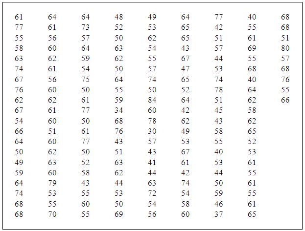
The free flow speed data of the cars collected on the National Highway stretch in Guwahati, Assam, is shown in Table 2.1. Total number of observations is 169 and it has been observed that there is a considerable variation in the speeds and the maximum and minimum speeds are 84 and 30 km/hr, respectively. For displaying this data in a histogram, the data are divided into groups according to their magnitudes. Each group or class is of equal length and the length of the group is decided based on the range, the difference between the largest and smallest values over which the data are spread. The number of data points falling in each class or group is the frequency corresponding to that group. The number of classes should be at least 5 and not more than 25, and as a thumb rule it should be close to the square root of the number of data points. Data on car speeds is grouped into 11 classes and the corresponding frequency computations are shown in Table 2.2.
Table 2.1: Observed Speed data of Cars
Absolute frequency versus the middle point of the class, in the form of the histogram, is shown in Figure 2.1. It is normally presumed that the free flow speed data follows normal probability distribution and the histogram shown in this figure more or less is indicating the same. This approach gives a basic idea on the accuracy of the assumption made. For the same data the relative frequency histogram is shown in Figure 2.2. In Figure 2.3, the relative frequency polygon is shown. This polygon is obtained by joining the mid points of the blocks in the histogram. This is nothing but a probability curve when number of observed data points tends to infinity and the class widths are reduced, and this curve is known as probability density function of the population from which the data have been observed.