| |
Relative Colors
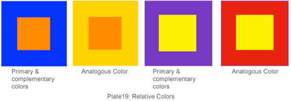
Human beings experience about color in relation to other colors (Plate19). Color cannot be judged in isolation. Colors are "relative" because they seem to change depending on other colors that they are near. For instance, if we put an orange square on a blue background, the orange seems brilliant, almost shimmering. If we put the same orange square on a yellow-orange background, it doesn't stand out. The intensity of orange and yellow clash with each other resulting minimizing their contrast. The back ground of yellow is minimizing the brilliance of orange. Orange and yellow-orange are analogous colors on the color wheel, and have less contrast, as do other analogous colors. The highest contrasting colors are yellow and black. Because they are so visible, yellow and black are used for danger signs on highways. Yellow and black is commonly used in airport signs because of clarity and visibility. The warmth and coolness of a color is relative also. Next to green, red-violet seems very warm. However, placing red-violet next to red makes the red-violet seem cooler. The highest contrast of warmth and coolness between complements is red-orange and blue-green. Color relates to a country's culture. Different colors can have the same emotional meaning in separate cultures. A bride in the United States traditionally wears white, but a bride in Japan wears red. Whereas white is associated with prayer or mourning in India in some parts. Holidays are often associated with certain colors.
 |
(Read more: http://www.smashingmagazine.com/2010/01/28/color-theory-for-designers-part-1-the-meaning-of-color/ ; May 31, 2012)
Conclusion
The property of color is an essential subject for the artist and the designers to understand its scientific and qualitative aspects for fruitful applications. |