Lecture 4&5
Seven Basic Quality Control Tools
- Histograms
- Run Charts
- Pareto Charts
- Flow Charts
- Scatter Diagrams
- Cause and Effect Diagrams
- Control Charts
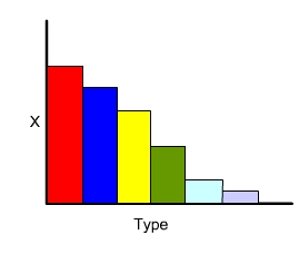
Histograms
A Histogram is a bar graph used to present frequency data. Histograms provide an easy way to evaluate the distribution of data over different categories
Steps in making Histogram
|
The histogram reveals the following about the process
-
Centering of the process data: The centering of the data provides information on the process about some mean.
-
Spread of the data: Histogram width defines the variability of the process about the mean
-
Shape of the histogram: Bell or normal shaped histogram is expected. Other than normal or bell shape means something wrong with the process responsible for poor quality.
Limitations of the Histograms
- The randomness in the data in developing histogram losses the vital information
- As data are not represented in order, the time-dependent or time-related trends in the process may not be revealed
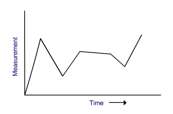
Run Chart
Run Charts are better option over histograms as they overcome the limitations of the histograms. A run chart represents change in measurement over a sequence or time. Run charts are used to determine cyclic events and their average values.
Steps in making Run Charts
The run chart reveals the following about the process
|
 |
Two types of mistake normally people commit while interpreting the run chart
- cycle or trend exist but actually it is not
- cycle or trend does not exist but actually they exist
To overcome this problem a thumb rule is to look at the data for a long period of time
Pareto Chart
VILFREDO PARETO an Italian economist provided a golden rule which fits into many managerial situations. The golden rule he noticed is �WEALTH IS CONCENTRATED IN A FEW PEOPLE�. Pareto principle : �The majority of wealth is held by a disproportionately small segment of the population�. This principle is also known as 80 / 20 principle. 80% of the problems are caused by 20% of the causes
JURAN has noticed that this principle applies to quality improvement as well. According to Juran the problems that occur a few are very frequent while other important problems occur seldom. He given the phrase as �Vital few and the trivial many�
Pareto Charts are used to apply the 80/20 rule of Joseph Juran which states that 80% of the problems are the result of 20% of the problems. A Pareto Chart can be used to identify that 20% root causes of problem.
A Perot chart is similar like histogramSteps in making Pareto Charts
|
 |
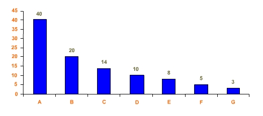
The Pareto Chart of the following problem is given below:
|
Problem Type |
Frequency |
Annual Cost on Rs.1000 |
Cumulative% |
|
A |
40 |
20 |
40 |
|
B |
20 |
6 |
60 |
|
C |
14 |
3 |
74 |
D |
10 |
2 |
84 |
|
E |
8 |
2 |
92 |
F |
5 |
1.5 |
97 |
|
G |
3 |
1.8 |
100 |
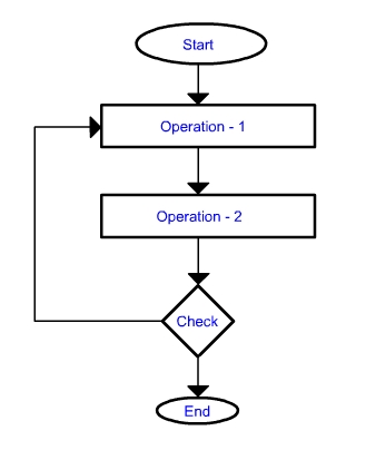
Flow Chart
A flow chart is way of representing a procedure using simple symbols and arrows. A Flow chart shows the activities in a process and the relationships between them. A Flow chart lets a process be understood easily. It also demonstrate the relationships between the elements of the process.
|
Steps in making Flow Charts
|
 |
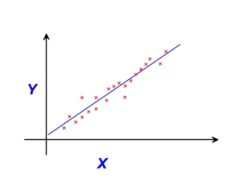
Scatter Diagram
Scatter diagram is a statistical chart which shows a trend in a series of data. It demonstrates correlations between values.
Steps in making Scatter Diagram
|
 |
Cause and Effect Diagrams (Steps)
A Cause and Effect Diagram shows the relationship between effect and the categories of their causes. The diagram look like a fishbone it is therefore also called fish-bone diagram. Cause and effect diagram enables a team to focus on the content of a problem. It helps to provide a comprehensive picture of the problem and the root causes of the same.
Steps in making Cause and Effect Diagram- Determine the Effect or Problem
- Categorize the possible causes
- Describe the possible causes
- Draw an arrow horizontally pointing to an effect
- Draw four or more branches off the large arrow to represent main categories of potential causes. Typical categories are man, machinery, methods, and materials.
- Secondary causes can be listed on branches off the category branches.
- Additional causes can be branched off the Secondary causes.
- Additional Causes, if any, may further be branched off the tertiary causes. The process goes on till all the possible causes have been explored.
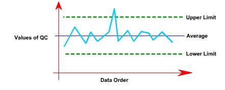
Control Chart
Control charts are statistical tool, showing whether a process is in control or not. It is a graphical tool for monitoring the activities of an ongoing process also referred as Shewhart control charts.
Steps in making control chart
- Define Upper limit, lower limit and Center line
- Draw Chart
- Plot the data points into chart
- Interpret the control chart
Details regarding control chart is given in the next lectures