|
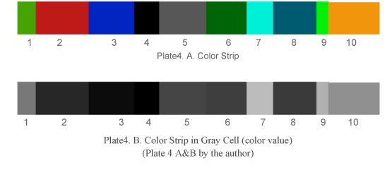
Human eyes experience various gradations of colors. The relative lightness or darkness of color is called color value. Understanding color value is an important knowledge for designers and artists. From ancient period throughout the world we have used such knowledge to create illusion. Ajanta murals have beautifully applied the same technique of color contrast to create color dimensions. It is an important tool for the designer/artists to create spatial relationship. In nature there is no line. Contrast of color creates line. Value contrast separates the object creating demarcation between two, while the tonal variation or gradation suggests the curvature to suggest volume. Therefore if intentionally or unintentionally the color values merge with each other they tend to lose the volume and appear flat (plate1.B).
The above pictures (plate 1 A&B and plate 2 A&B) are shown with their color values. Color value helps us to realize volume. We have more number of ‘rods’ compare to ‘cones’. Rods help us to identify objects in dark while we cannot recognize the color. ‘Cones’ help us to recognize colors. Based on the color intensity of the color in contrast to other color some areas appear nearer. The Butterfly (plate1A) appears quite colorful; however its color merges with the background when converted in color value (gray cell). In the Plate3 A the blue color is seen against black strip; in this case the blue color appearing closer because of its contrast against black color strip. On the other hand in Plate3 B the same blue strip is seen against a bluish-gray strip where the blue tends to recede back. Therefore the lightness or darkness of color carried higher or lower value.
(Ref. http://char.txa.cornell.edu/language/element/color/color.htm ; May 29, 2012)
|