Equiluminant (ambiguous) colors
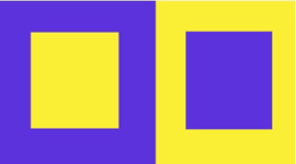
In 2-D design the technique of “equiluminance” to blur outlines and suggest motion is widely used (Plate21). We cannot perceive the edges of objects where object and background have the same luminance. If parts of a painting are equiluminant, their positions become ambiguous. They may seem to shift position or to float. The ‘blur’ edge creates an impression of dynamism instead of static condition. 2-D artist and designers have successfully applied such technique to generate dynamism. The combination of colors such as, blue and orange, violet and yellow, red and green, etc can create such impression of dynamism based on the size and area. Human eyes are sensitive to such combination of colors. Equiluminant colors have long been recognized by artists as being special because they can generate a sense of vibration, motion or sometimes an eerie quality. This strange quality arises because of a particular system can see something that the other system cannot; with only a particular system activation in isolation we can identify a particular object, but its position and motion (or lack of motion) are undetermined.
 |
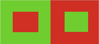 |
| Plate 21 Equiluminant (ambiguous) colors |
 |
 |
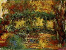 |
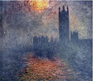
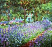
| Plate 22 Impressionism (Claude Monet) |
The contrasting colors produce the invisible strength of line which slowly merges with another (background) while blurring the colors by mixing. Impressionist painters have created such color pallets where colors have merged with each other (Plate22).
The above paintings typically express the Equiluminant Colors that are self contrasting because of the combination of primary and secondary (complementary) colors. Impressionist painters frequently applied equiluminant colors that created higher luminosity in the color scheme. |