Color Harmony
 |
| Plate3 Color Harmony in Nature |
(Source:http://www.google.co.in/search?hl=hi&q=color%20harmony%20photography&bav=on.2,or.r_gc.r_pw.,cf.osb&biw=
1280&bih=585&um=1&ie=UTF-8&tbm=isch&source=og&sa=N&tab=wi&ei=XDDtT5-OGIjMrQfji52-DQ ; June 29, 2012)
Harmony or a sense of rhythmic relationship can be defined as a pleasing arrangement of parts- it is applied in color, music, poetry, dance, choreography, etc. In visual experience, harmony is something that is pleasing to the eye. It engages viewer and it creates an inner sense of order, a balance in the visual experience. The human brain will reject under-stimulating information. At the other extreme is a visual experience that is so overdone, so chaotic that the viewer cannot stand to look at it. The visual task requires that we present a logical structure. Color harmony delivers visual interest and a sense of order.
 |
 |
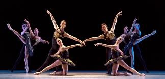
| Plate4 A Extreme unity leads to under-stimulation |
4 B Extreme complexity leads to over stimulations |
(Source:4Ahttp://www.google.co.in/search?um=1&hl=hi&biw=1280&bih=585&tbm=isch&sa=1&q=balance+in+choreography&oq
=balance+in+choreography&gs_l=img.3...128120.134533.0.135298.12.1.0.11.11.0.324.324.3-1.1.0...0.0.zc8PCafoC-U ; June 29, 2012
4Bhttp://www.google.co.in/search?um=1&hl=hi&biw=1280&bih=585&tbm=isch&sa=1&q=poster+design+ideas&oq=Poster+
design&gs_l=img.1.1.0i19l10.5580.8609.0.14193.13.11.0.2.2.0.347.1633.5j2j2j2.11.0...0.0.BcFcsh4vs08 ; June 29, 2012)
Extreme unity leads to under-stimulation because of calculated predictable expectation (plate 4 A). Human beings love to expect unexpected surprises. On the other hand over stimulation and complexity may result in creating negative impression. Therefore, the balanced composition is the most challenging aspect in design which is the combination of multiple components. Harmony is a dynamic equilibrium. Interestingly nature does not create color harmony. It happens naturally. Human being tries to create harmony. Description of color scheme in art (painter's palette) must account for all three properties.
Color Context
 |
| Plate3. Color Viewed in relation to another color |
Color is viewed with the help of shape and their relationship with other colors. Naturally in design, consideration of color has to be in relation to other colors and shapes are a complex area of color theory. Color may be seen objectively based on its own merit. Red does not have to symbolize as fire, yellow does not represent sand. In the profession of design colors are applied with great care so that it justifies its presence. The purple strip in the plate (plate3) shows each time the same color (purple) appears differently due its association/contrast against other background colors. Therefore, each color has to be seen in the context of other colors.
The meaning or the semantics of color is based on multiple factors- social, cultural, objective, psychological, etc. Therefore, arrangement of colors could be from pure arrangement of colors to symbols and metaphors.
Color may be applied in various ways. In art and design color has direct or indirect relationship with human perception. Herbert Read, renowned art historian, scholar and philosopher has aimed to classify the application of color in four categories. |