|
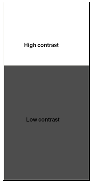
Fig.154: Good contrast is necessary for readability.
If there isn't enough value difference, even if there is a difference in hue (colour), it will be hard to read text. See the fig.155 bellow.
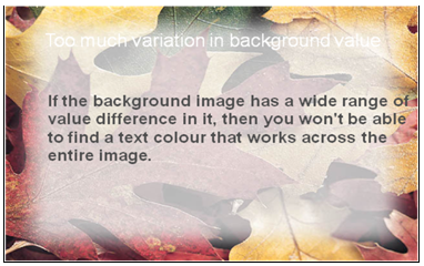
Fig.155: Placing text on background with a wide range of values results in poor readability.
(The above lectures consist of illustrative examples in order to help understand the theory in a simple way followed by a range of hands-on assignments to enrich students manual skill and' understanding about the topic)
|