|
Lecture-5
Visual Weight of colour:
When viewing a composition, what we perceive as giving design elements varying degrees of interest. It depends on visual weightage we try to depict in a composition. Typically, visual weight is attributed to objects which are saturated in colour, are larger in size, possess a contrasting value to the rest of the composition, or are placed closer to the edge of the page. Below are examples of such layouts. (Composition).
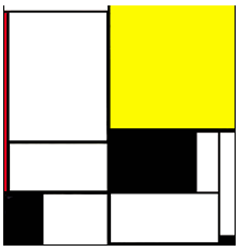
Fig.149: Right Heavy Composition
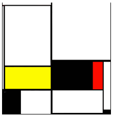
Fig.150: Bottom Heavy Composition
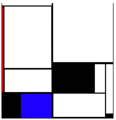
Fig.151: Left Heavy Composition
|